This case study is password protected.
Enter the password to view it.
Incorrect password. Try again.
Making security feel human for over 15 million travelers.
How can we use SMS verification to make signing in feel faster, simpler, intuitive, and actually secure for Expedia travelers?
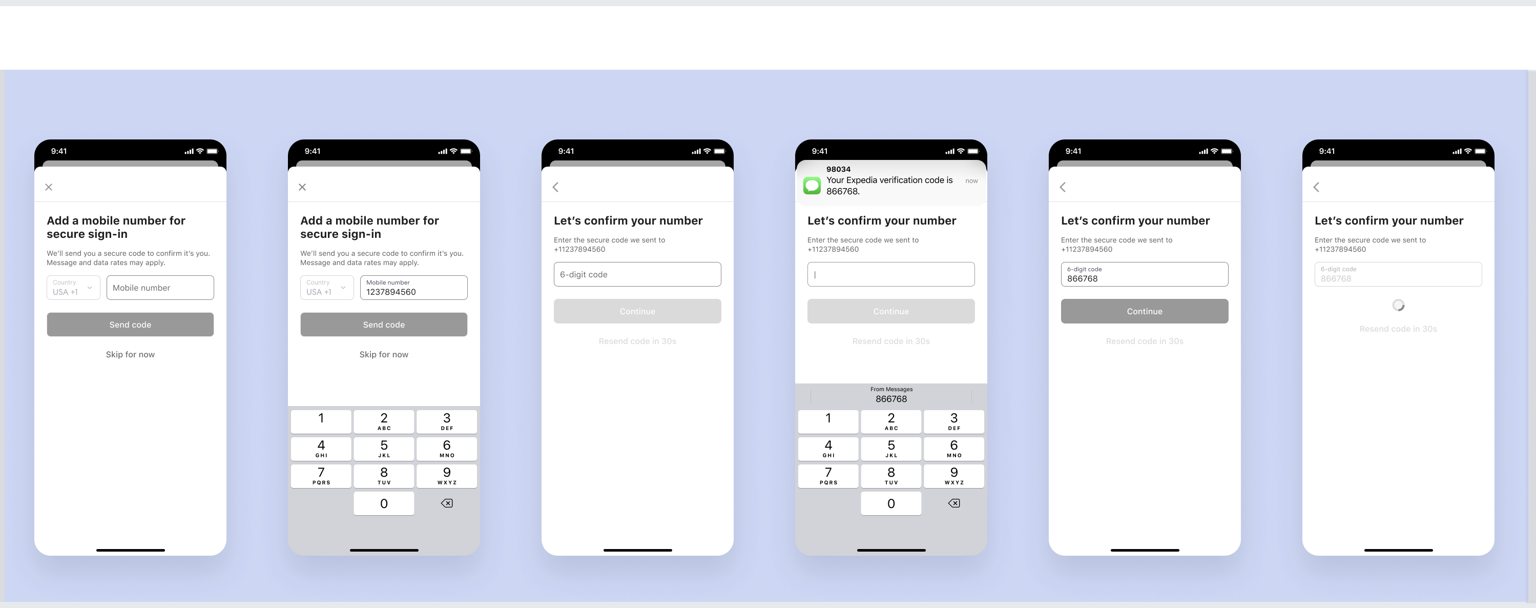
Snapshot
SMS-OTP reached over 15 million mobile numbers across Expedia and Hotels.com with an 85% flow completion rate.
- Process
-
- One quarter, 2024
- One round of user testing
- Figma collaboration, content docs, and syncs
- Legal, Security, and Privacy reviews
- Multiple content quality reviews
- Team
-
- Core Team: Content Designer (me), UX Designer, UX Researcher, Product Manager, UX Design Lead.
- Stakeholders: Director of Product, Director of Marketing.
- Strategic impact
-
- Within a few months of release, SMS-OTP was processed by over 15 million mobile numbers, across Expedia and Hotels.com in the United States.
- Bolstered by an 85% success rate for people completing the flow.
- Reduced friction in security protocols by aligning Marketing, Legal, and UX goals.
When users speak, the content changes.
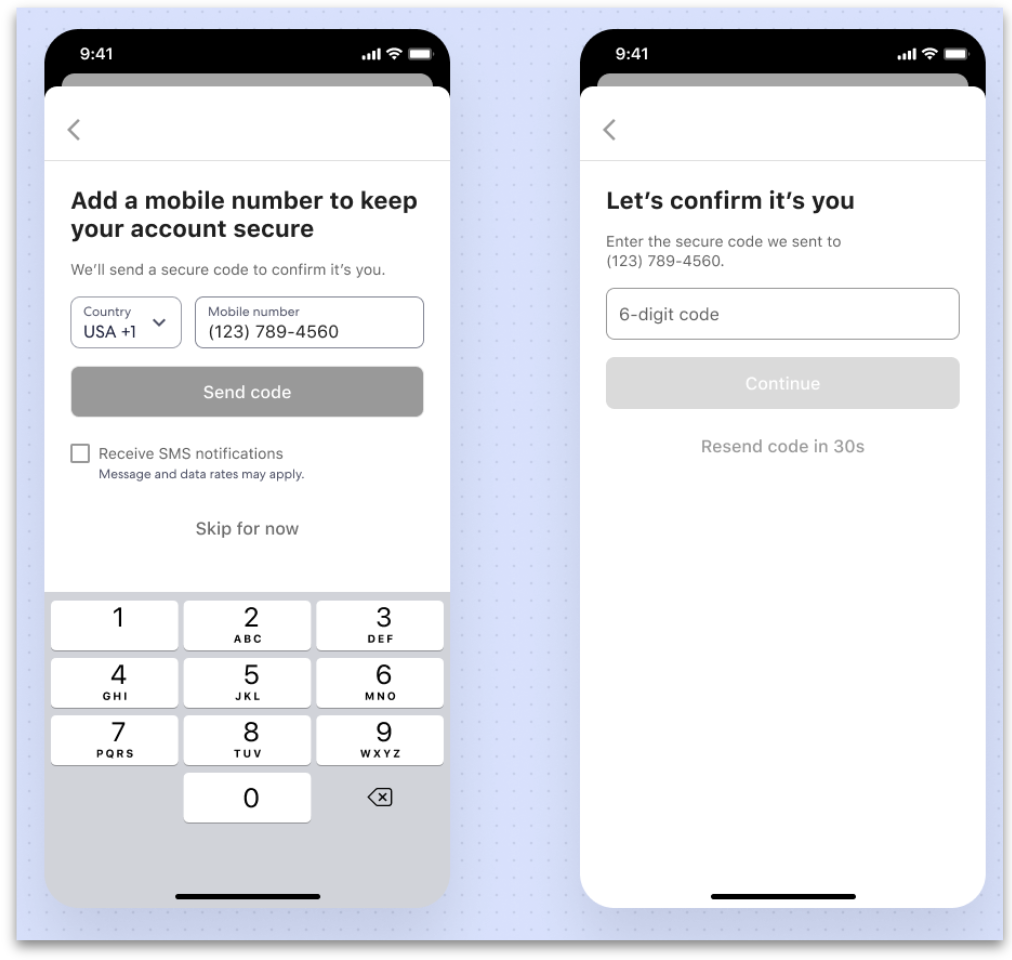
- Users easily navigated the screens and appreciated the added sense of security.
- Here's a great example of a content battle: the marketing team wanted to add a marketing opt-in checkbox to a security flow. This was a hill I was willing to die on — I couldn't fathom being the content person who let the marketing checkbox slide into the flow.
- Testing showed users found it distracting and confusing in a security flow. 9 out of 10 users didn't check the box. I used this data to successfully get the checkbox removed, keeping the focus entirely on security. I'm all for marketing, but not when it messes with core trust.
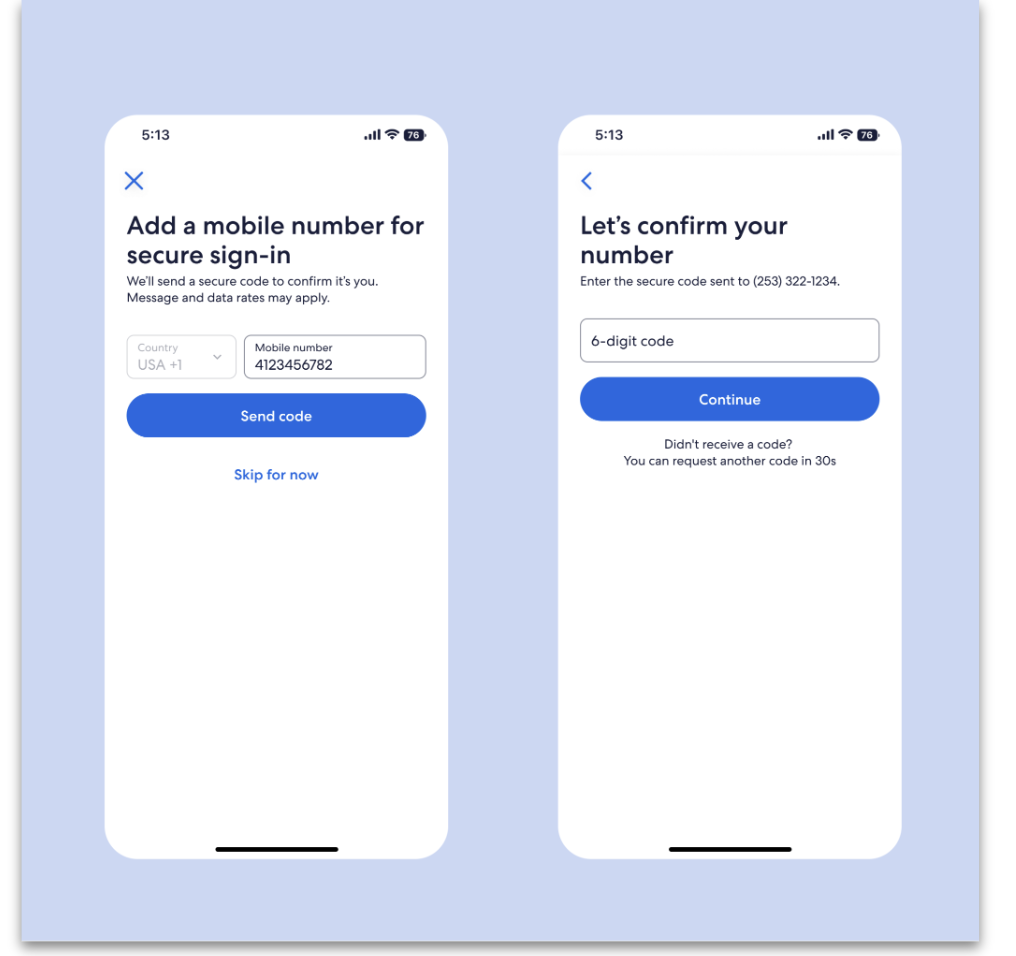
- Tweaked wording to reflect user suggestions for improved clarity.
- Added a legal disclaimer to address potential fees associated with the feature.
- Met with stakeholders to have a conversation about removing the out-of-place marketing checkbox. It was a lot easier to have this conversation with user data to back up our position.
Your data, your call. Period.
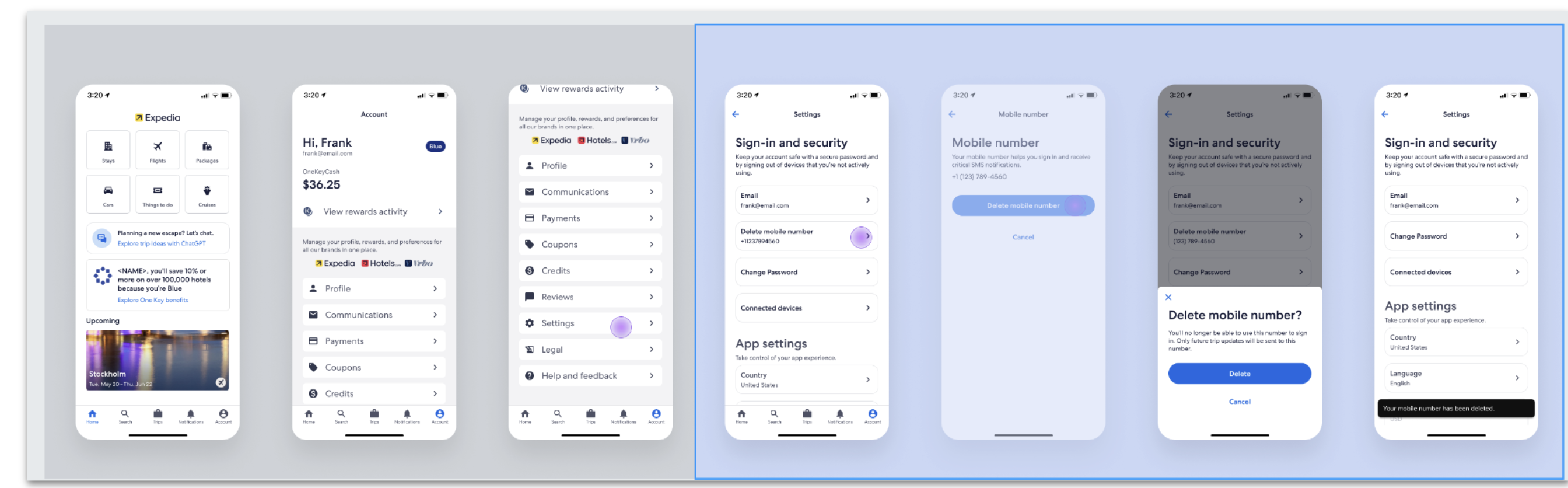
We added a way for travelers to delete their mobile number directly from settings. This wasn't in the original product requirements.
It should have been. Asking someone to add personal information without a way to remove it isn't a security feature — it's a trap.
When something goes wrong. Error recovery.
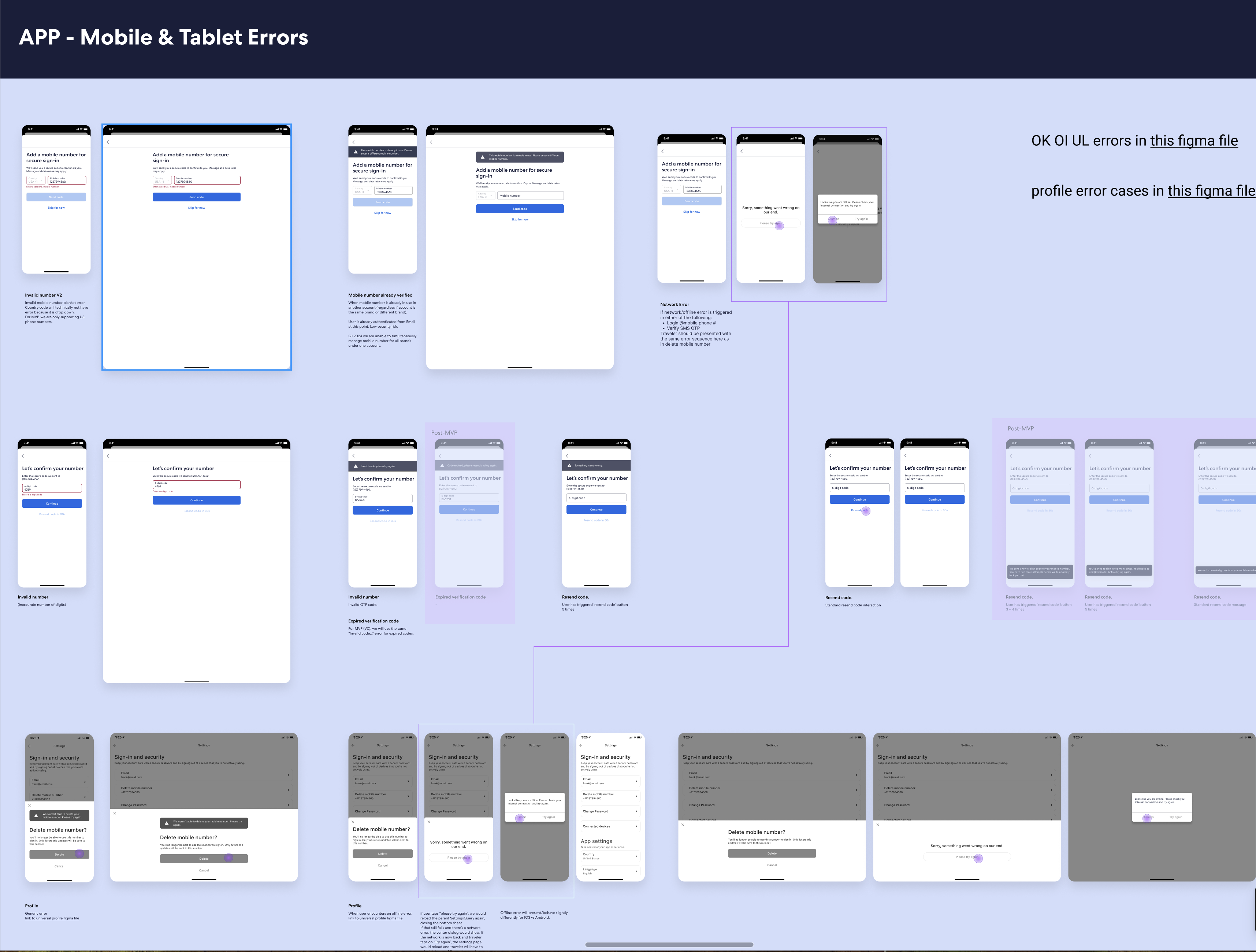
Errors are frustrating, but they're also a chance to rebuild trust. Instead of dead ends, we gave users a clear next step: a plain-language explanation of what happened and exactly what to do about it. Since this was a new feature, I wrote all the error messages.
Key takeaways.
I used to think the hardest part of content design was finding the right words. This project taught me the hardest part is wrangling all the stakeholders to get them on the same page.
Working across Legal, Security, Marketing, and UX meant every content decision landed in a room full of competing priorities. I learned quickly that taking an evidence-based approach — like "9 out of 10 users ignored this" — is the easiest way to sway stakeholders. Research isn't just a design input. It's a persuasion tool.
What I carry forward from this: users can't speak for themselves in a stakeholder meeting. But their behavior can, if you document it well enough and show up prepared to use it. That's the skill I didn't expect to leave with — and the one I use most.