This case study is password protected.
Enter the password to view it.
Incorrect password. Try again.
Taking the algebra out of financing a new iPhone.
How I helped customers compare carrier deals without doing the math themselves.
The problem
Customers shopping for a new iPhone and rate plan on the Apple Store App were struggling to understand the true cost of ownership. There were too many variables in play: rate plans, bill credits, financing options through Apple or through the carrier. Customers couldn't easily get to the bottom line: How much would this actually cost per month? How many separate bills would they end up with — one, two? And was it even a good deal? Apple needed a messaging and merchandising system that made carrier offers legible, without customers feeling like they were doing algebra just to buy a new iPhone.
Snapshot
- My role
- I led content strategy for the messaging architecture behind the Carrier Deals experience: message hierarchy, a value-proposition taxonomy, entry-point copy across five surfaces, devising the compare table labels and information architecture, and error states.
- Scope
- Build a purchasing flow that lets customers across the United States finance a new iPhone at Apple while getting a new rate plan or even staying on their existing rate plan from one of the Big 4 carriers: AT&T, Boost, T-Mobile, and Verizon.
- Goal
- Help customers understand the total cost of their iPhone and service across every Carrier Deal they qualify for, by giving them a clear way to compare financing terms side by side — a uniquely Apple way to shop carrier deals.
How I got there
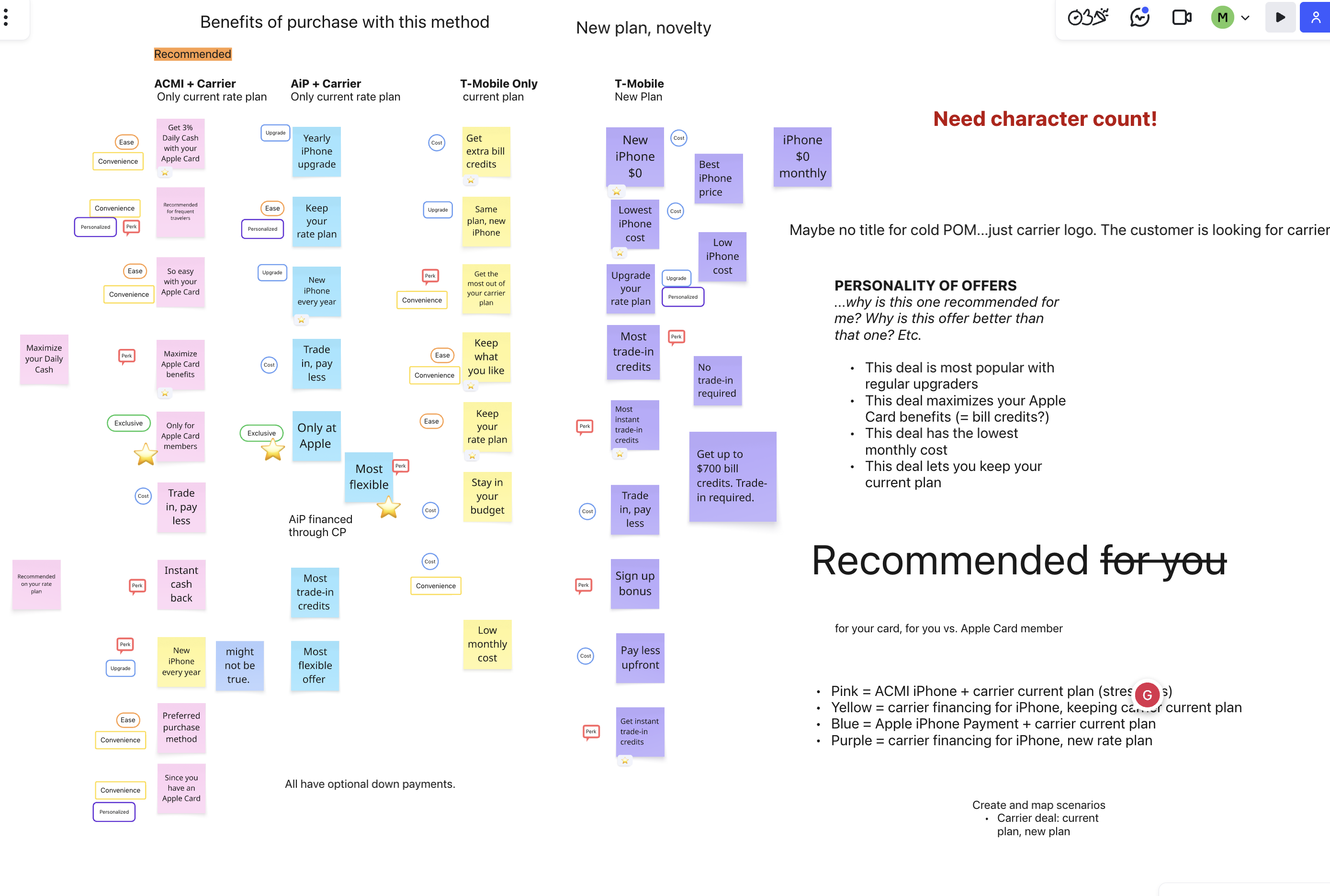
We needed a tagging system for carrier rate plans and iPhone financing that could surface each offer's unique value proposition — a fast way for customers to eyeball what actually made one offer better than the other for them. We had an ideation session where the wider team brainstormed candidate tags.
Where we landed
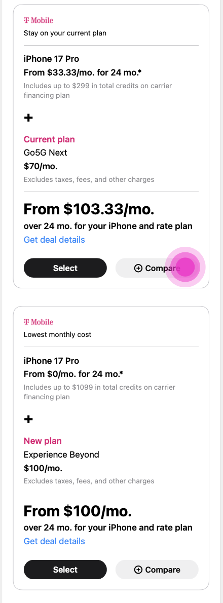
After several rounds with Apple's Creative team, we landed on a small set of tags to apply directly to pricing cards. The value propositions tested well — clear enough that Creative could see immediately how each one clarified an offer, and simple enough to hold up across every financing path.
Helping customers compare offers side by side
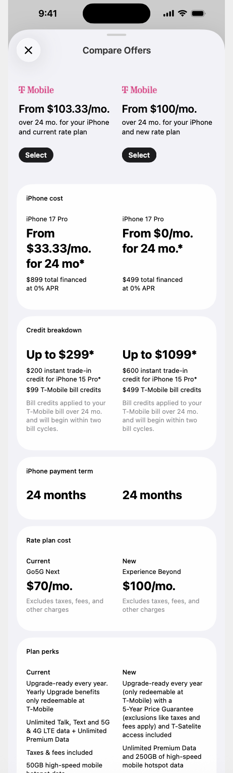
Not every offer serves every customer the same way — someone planning to keep their iPhone past the financing term has different priorities than someone who trades in every year. So we built a compare flow where customers could select the plans they were considering and see them side by side. Getting the labels right took real iteration: each one needed to let customers scan the list and understand exactly what distinguished one plan from the next, at a glance.
When something goes wrong. Error recovery.
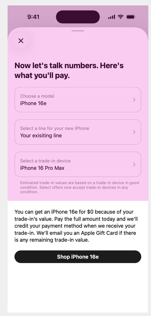
Errors are frustrating, but they're also a chance to rebuild trust, or even provide a new path forward. Instead of dead ends, I gave customers a clear next step: a plain-language explanation of what happened, and exactly what to do about it.
Key takeaways
Apple runs a famously compartmentalized org where multiple high-level, confidential projects are always in motion, and they shape your work in ways you're often not told about, you just have to move in the direction your told go in, and go there. Scope on this project shifted more than once, with no explanation offered. The job was to listen for the shift and pivot fast enough to keep delivering. What started as a project called Apple ways to buy ended up shipping as carrier deals on iPhones at Apple.